Texturize Your Space for Summer with Farmhouse Flare Designs
/Kristen from Farmhouse Flare Designs has been busy refreshing her starter home one room at a time. Most recently, she made some updates to her master bedroom and she’s sharing her tips for adding texture to a room with us below. Be sure to follow her on Instagram and subscribe to her blog for a steady stream of inspirational content!
Take it away, Kristen!
Small spaces can sometimes be difficult to style, but your girl works with what she’s got! I know life seems like it’s full of these huge gorgeous homes that seem so far out of reach, but we all start somewhere, don’t we? Sometimes I find it hard to believe how far our little starter home has come, but I know this isn’t our forever home. AJ and I have been VERY busy with something and I’m so excited to share this with y’all. In the meantime, let’s keep talking about this little starter home of ours.
Most of the rooms are a relatively small but good size. You can’t really get all of the crazy wide angles, but that’s when you have to get a bit creative with the camera to make the room look a bit bigger. For a good amount of time I found myself struggling with the space that I had, and I just didn’t know how to place things. Well, something clicked and it was the fact that we had too big of furniture for the space we were trying to create. Although that big cozy U-shaped couch was comfy, it was a testament to finding items that were a bit simpler and smaller.
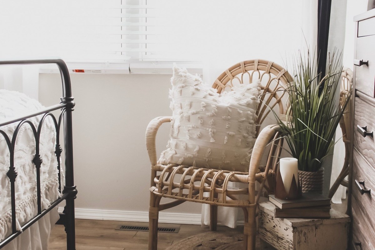
So, I worked on each room, but one room at a time. Our most recent room that was refreshed was our bedroom. I have changed literally everything in there except the TV and the dresser. It is a cozy “master” bedroom, but just something was missing. When I put the new bed frame together, it was a lot smaller than our last one that AJ custom built so my little corner space was catching my eye. Now…I don’t want to be one of those people who has to fill every corner, although AJ might think differently. I just really like to have a few key focal points.
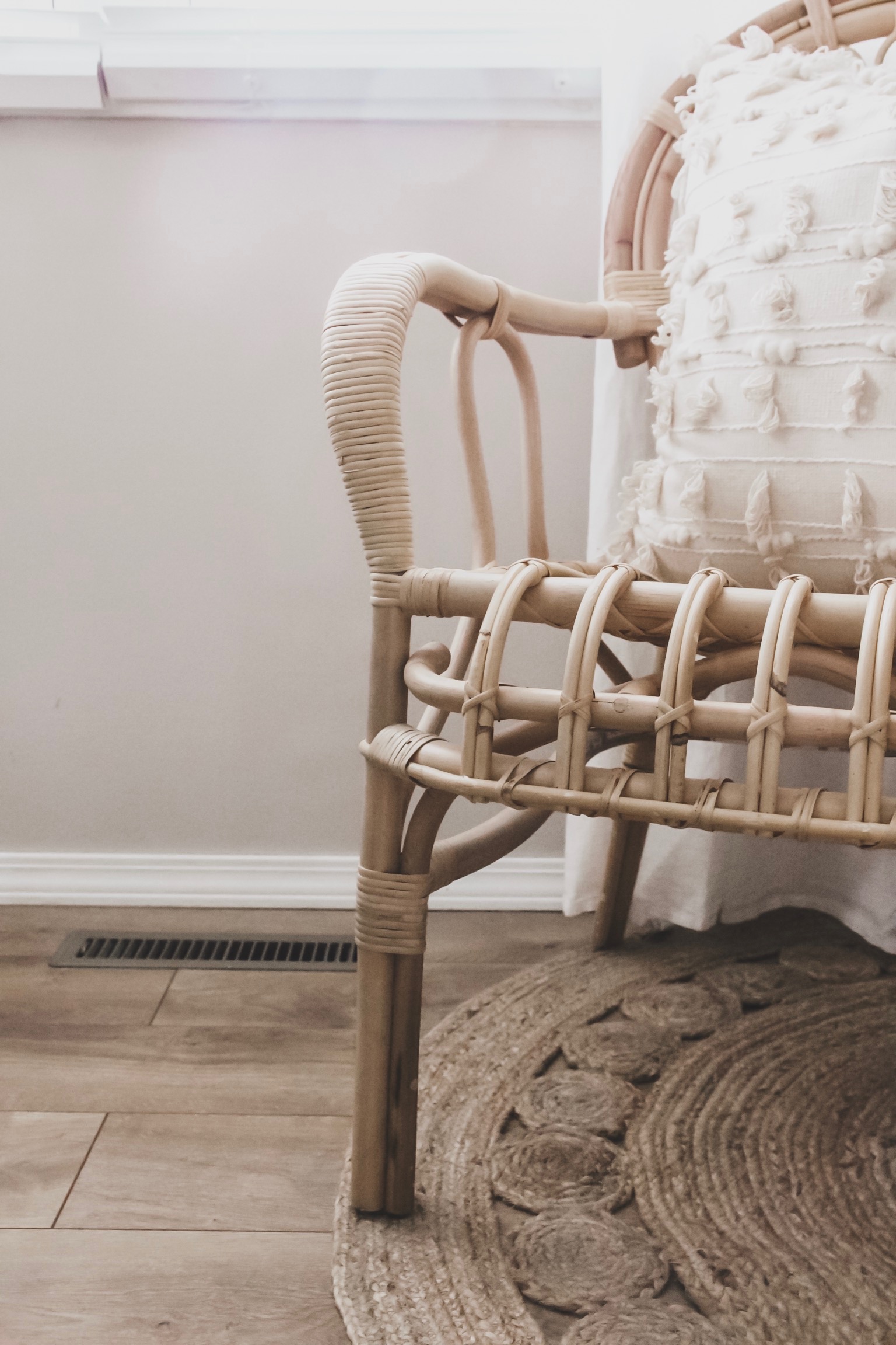
When Kirkland’s asked me to partner for their texturizing spaces campaign, I knew this was the spot for the item! Right away I saw this Rattan Accent Chair and knew it would fit perfectly. I’m loving the whole adding texture to a room, but am focusing on simple texture. I’m really trying to go with more items that don’t necessarily scream at you, and that they would match multiple areas. Still on the whole neutral ride though!
I tend to hear the, “Kristen I don’t know what pieces or decor will look good together,” quite a lot. I completely understand the whole not having the visual or being able to see how things look. I feel like sometimes I even feel this way until I think about a space for awhile. Sometimes I don’t even know what I’m going to do until I find a certain piece. That’s a little of how I felt when I saw this chair. I had another chair there before and it just didn’t quite fit the look. Then I saw this one and it was like BAM, here it is! And I’m so happy with how it turned out in our room.
Some might wonder, why would you need a chair in your bedroom? Well two things: 1. I need a place to put my bed throw pillows somewhere and 2. When I wear heels, I always need a place to sit to put them on. The bed is just too high and so this chair not only looks pretty but it is practical as well.
So, have I convinced you yet that you need a bedroom chair of your own? If so, head over to Kirkland’s page! They have literally the BEST accent chairs. I have never found chairs I love more than there.
Stay tuned to see more exciting collaborations with Kirkland’s! I’m going to show a bit more detail around the modern farmhouse lamp we added to AJ’s man-cave.

